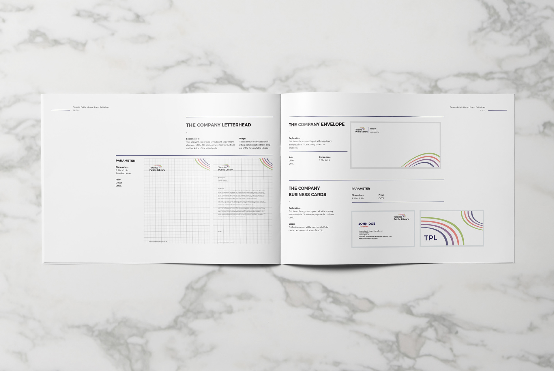


Because The TPL is such a strong community hub which continues to build on it’s services, values and strengths. While continuing to transform through technology. This logo works perfectly with the image of the Toronto Public Library and stands out from the competition while keeping a classic clean look. This concept is called the “Unity” concept. This concept explores the many different elements offered at the TPL. We used the original arches as a huge inspiration to our logo concept. The 4 rings or “waves” represent the 4 pillars in which The TPL strongly bases their brand behind. (Read, Learn, Create, Deliver) The colour palette is a very minimal pastel grouping giving the Logo a professional yet playful feel. We also felt like it was necessary to isolate the capital “TPL” as a simple social media icon or secondary option to the logo.
